Categories
Android Research

KISSing and Shopping

KISS is a principle stating that the simplest solution for a problem should be preferred. KISS may stand for “keep it simple, stupid”, “keep it short and simple” or other similar variations. The idea is to avoid building unnecessarily complex solutions which are difficult to maintain and use.

Lately I was shopping and carrying a huge list of items. The more items I put into the cart the more difficult I got to keep track of which items are still missing. I did not bring a pencil so I could not cross out the items I already got.

As a researcher and a mobile application developer I tried to find help in the iPhone’s App Store. If you do a search on Shopping List App you will find plenty of apps already exist on that problem. But every app I found required to enter the shopping items via keyboard into a list. For me, who is not good at typing with the iPhone’s keyboard this not practical once there are more than a handful of items to buy.Some solutions offer to create the shopping list via web on your desktop PC and then access it from your mobile. That solution makes it faster to enter the items, but if you are away from your PC or it is not running the advantage disappears.

Hence, I still prefer paper, since it is fastest to write down some lines whenever they come into mind.

So, what I did is applying the KISS principle to the shopping list problem. My constraints were that it should be as easy as with paper to take down notes, but I want to store the list into my mobile so I can carry it with me and mark items as done.

The result was an app called Paper Shopping List. It works is KISSingly simple:

  1. Write a shopping list on paper (!)
  2. Take a photo of the list with the app
  3. Cross out items in the photo as they are done


Step 2: Take a Picture of a Paper Shopping List
Step 3: Cross Out Items on the Screen

It not at all perfect, and many convenience features are missing, but still it allows you to quickly write a shopping list and keep track of what items you have already put into the cart.

The app is available for free in the Android Market: Paper Shopping List

Share this:
Share
Categories
Research

To blog or not to blog ongoing research?

Research ideas are old when they are finally presented. The time from the submitting a paper to its presentation at a conference can take more than half a year. When submitting a paper the authors have already spent a lot of time working on the idea and writing it down. When the paper is accepted and finally available to the public, I have often already lost the initial excitement for the research idea.

But can researchers blog about ongoing research?

The excitement would still present at the time of writing. Other researchers’ comments could be incorporated before all the work has been done and documented. You could sort out ideas early that will not make it through the reviewing process anyways.

Unfortunately we are living in a world where novel and original ideas are one of the main assets of a researcher. The originality of a submission is usually one of the main review criteria’s. But if a research idea has been published in a blog others may already have picked it up so it is not original anymore. The submission containing the idea may get rejected and not appear as a publication in the researchers CV.

So, as long as researchers are judged by their publications novel ideas will probably remain in the vault until published. I wonder how a world would look like, where this is not necessary anymore.

Share this:
Share
Categories
Projects Research

Counter-Strike? Research?

Eight people in the twilight, starring at eight screens, hammering their keyboards, wielding their virtual guns … and all for research purposes?

Counter-Strike is a well-known team-based first-person shooter game. Since shooting is an essential part of the game play, it has a bad image in the public. Whenever a young gunman runs amok, Counter-Strike is the first to blame for many conservative politics.

But, games, such as Counter-Strike, can be fantastic research tools. Players need to process a large amount of information as quickly as possible to be successful. For user interface researchers, this comes in handy when novel interface shall be tested in high cognitive workload situations.

In our previous work we had developed a tactile user interface that allowed sensing the location of people via the sense of touch. To test this user interface we integrated it into Counter-Strike. It gives the wearer a sense of where the team mates are at any time.

The direction of the team mate is indicated by where the vibration occurs. The distance is indicated by the number of pulses.


We conducted a study where two teams of participants compete against each other. The teams where alternately equipped with the tactile location sensing system. We found that the tactile location sensing system increased the team’s situation awareness and its performance. Despite the games high cognitive demands the participants were able to interpret the tactile cues.

And the best is … this project scored a publication at the most prestigious scientific conference on human-computer interaction: the ACM Conference on Human Factors in Computing Systems (CHI).

Share this:
Share
Categories
Projects Research

Sensing your Friends’ Locations via the Sense of Touch

Imagine visiting a crowded place with a bunch of friends. Wouldn’t it be great to unobtrusively stay aware of where they are? Thanks to 3G, GPS, and powerful handhelds, today it is perfectly possible to share the location in such a mobile context.

A remaining problem is how to present the friends’ locations to the user. Instead of constantly pulling the device out of your pocket you might rather want to enjoy the event. The environment may be noisy and crowded, making the interaction with the device difficult in general.

We therefore developed a system that displays the location of friends via the sense of touch. Specifically, we aimed at conveying the direction and the distance of a number of friends, so the user would have a rough idea of where her/his friends are.

For communicating via the sense of touch we used a tactile belt. A tactile belt is a belt that comprises a number of vibration motors (Tactors), which are distributed all around the waist when the belt is worn. It has been demonstrated by other research groups that users can easily interpret the vibration patterns as pointing directions. If for example the front vibration motor is turned on the belt seems to point forward.

In our system we used this to inform the wearer in which direction a friend is. Since we wanted to display the direction of more than one friend we iterated through the friends. Each friend’s direction is displayed for a short time before the system switches to the next friend.

To convey a location we added a distance cue into the tactile signal. From the direction and the distance we assumed the user could get a rough understanding of the friend’s location. We tested three different ways of encoding the friend’s distance in the vibration.

In the rhythm-based distance encoding the belt would pulse a number of times into the direction of the friend. The number indicates the distance. The more pulses, the further the friend is away.

In the duration-based distance encoding the belt would use a single pulse to display the friend’s direction. The distance is encoded in the length of the pulse. The longer the pulse is the further the friend is away.

In the intensity-based distance encoding the belt would use a single pulse to display the friend’s direction. The distance is encoded in the pulse’s intensity. The further the friend is away, the less intense the pulse becomes.

In an experiment we compared the three distances encodings to find out how accurate and intuitive they are. The rhythm-based encoding allowed the most accurate and intuitive distance perception. However, the intensity-based and the duration-based distance encodings made it subjectively easier to judge the friend’s direction.

Altogether, we could show that providing a rough estimate of e.g. the location of people via the sense of touch is possible.

Share this:
Share
Categories
Research

Turn-by-Turn Navigation – the Best Way to Guide Pedestrians?

Navigating from a place to another is an essential ability for a self-determined life. When navigating in unknown terrain, e.g. when going for a hike or when visiting a city as a tourist, people become increasingly dependent on navigation aids. Established aids range from signposts over maps to route descriptions. But, thanks to the increasing number of GPS-enabled mobile phones, a new navigation aid is becoming increasingly common: the GPS navigation system.

In principle, these systems behave like car navigation systems. The traveller’s location is displayed on a map, the route is highlighted, and turning instructions are given by symbols or speech. For cars, this way of guiding the driver has shown to be quite successful. Timely and accurate instructions are indispensable as the driver has to follow the traffic rules. For pedestrians, however, this type of information presentation may be too strict. Even worse, when providing too much navigation information, we neglect the human’s inherent navigation abilities and cause even disadvantages. For example, many people report that when driving a route by navigation systems, they cannot remember the route as well as they could before the area of car navigation systems.

Now just imagine a place that is roughly 1 mile away from your current location. If somebody would give you the rough cardinal direction of this place on demand, most people would reach it easily. We tested this kind of navigation in research group and currently offer it in the PocketNavigator. First, the user specifies the destination by selecting it on a map. The handheld then creates vibration patterns that indicate whether the destination is ahead, to the left-hand side, or to the right-hand side.

First studies show that pedestrians can effectively and efficiently navigate with such as directional cue only. Thus, showing the direction of a destination “as the crow flies” could be a valuable additional to turn-by-turn navigation systems for pedestrians.

For more information see  “In Fifty Metres Turn Left”: Why Turn-by-turn Instructions Fail Pedestrians

Share this:
Share
Categories
Projects Research

Vibration-enhanced Paper Map Navigation

Maps are one of the oldest known information artifacts. An even in the times of GPS navigation systems, people still use them to find their ways in unknown environments.

One of the challenges when navigating by a map is that the map’s abstract content has to be matched to the traveler’s environment. It has for example been found that maps are easier to use when they are rotated so they align with the environment. We were interested if that matching would become easier if the user always knew were the destination was.

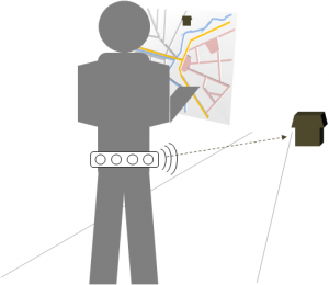
In our research we therefore coupled a GPS-enabled handheld with a vibro-tactile belt. The belt consists of eight vibration motors that equally distribute around the user’s waist. A built-in compass allows understanding in which direction the user is facing. The belt was then use to constantly vibrate into the direction of the traveler’s destination.

Traveler with a map and our vibro-tactile belt. The belt vibrates     into the direction of the traveler's destination.
Concept: convey the general direction of the destination with a vibro-tactile belt


In a field experiment with 16 participants we tested our approach in the wild. The participants had to reach two destinations, one with a paper map only and the other with the additional support of the vibro-tactile belt.

We found that the vibrational cues made participants less on the map, lose their orientation less often, and take shorter routes.

Share this:
Share
Categories
Research

How tiny flaws in the user interface can lead to negative user ratings

UI professionals keep repeating it: usability is a key to success. One of the most prominent examples is the iPhone 2G. When being released in 2007 it lacked lots of features that were already present in other devices, such as 3G networking, GPS receiver, or a camera. But it arguably it was just the easiest to use phone around then.

However, even when the system is easy to use in general, small usability issues can have huge negative effects. This post reports from an illustrative case that occurred in my research group. Currently, we are working on an Android application called PocketNavigator, which is basically a map-based navigation system.

Screenshot of the PocketNavigators main map view

While the core of the application seemed to be sufficiently easy to use, a rather small ambiguity in a secondary feature brought us bad user ratings.

Due to many requests we added a view that allowed searching for addresses. It provides a text field, where users can enter the address, e.g. “Berlin” or “1 Broadway, New York”.

The address search view as the user initially sees it.

For convenience, we stored the last 5 searches and made them accessible through a drop box. To not have to deal with an empty drop box when the application was just installed we initially filled it with five city names.

The address view with the unfolded drop box showing the name of the five initially stored cities.
The initially present cities.

After having released the address view in an update, we faced negative comments in the Android Market saying “only works in five cities”. We could not make sense of this until our colleague complained about the same issue. The UI was giving the impression that the text field only allowed to enter a street and the drop down box had to be used to select the city. So some user’s did not know they could enter any address including a street and a city in the text field.

We addressed the problem by slightly revising the user interface. First, we changed the labels to stress that the user could either enter an address or choose a previously entered one.

New layout of the address view

Second, the drop box would now be filled with complete addresses, such as “Tiergarten Berlin” or “10 Downing Street, London” to demonstrate what types of searches are possible.

The new entries are now more diverse, illustrating different possible entries.

With these countermeasures we hope to avoid such confusion in the future.

In summary, this case is a nice example of how a small usability issue can lead to a bad overall impression of an application. It reinforces that ensuring a good usability should never be neglected when developing an application for a wide audience.

Share this:
Share